Always Adapting
*
Always Adapting *
Designer with a focus on motion, storytelling, and interactive experiences. Work centers around creating visuals that feel intentional — blending clarity, rhythm, and emotion. Driven by curiosity and adaptability, each project becomes an exploration of how design can connect, move, and resonate with people.
This portfolio is built on a foundation of motion, print, and web design. Each one brings something different to the table—movement that shapes feeling, layouts that give ideas structure, and digital spaces that invite people in. Together, they let me explore stories from every angle and build work that feels thoughtful, engaging, and genuinely alive.
Motion Design
Motion design that blends rhythm, form, and storytelling to create visually engaging experiences. Each piece explores how movement, timing, and composition can transform design into emotion and atmosphere.
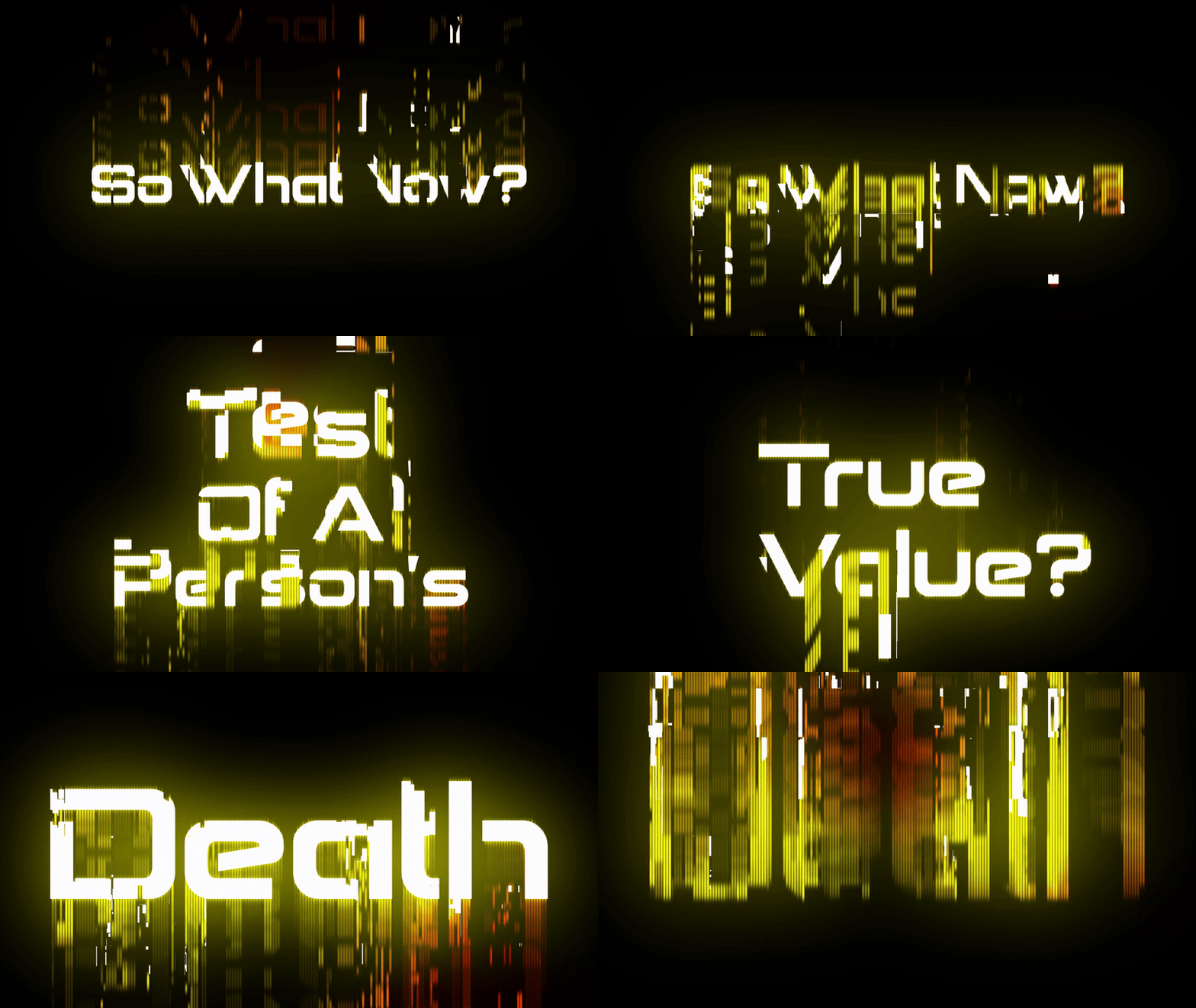
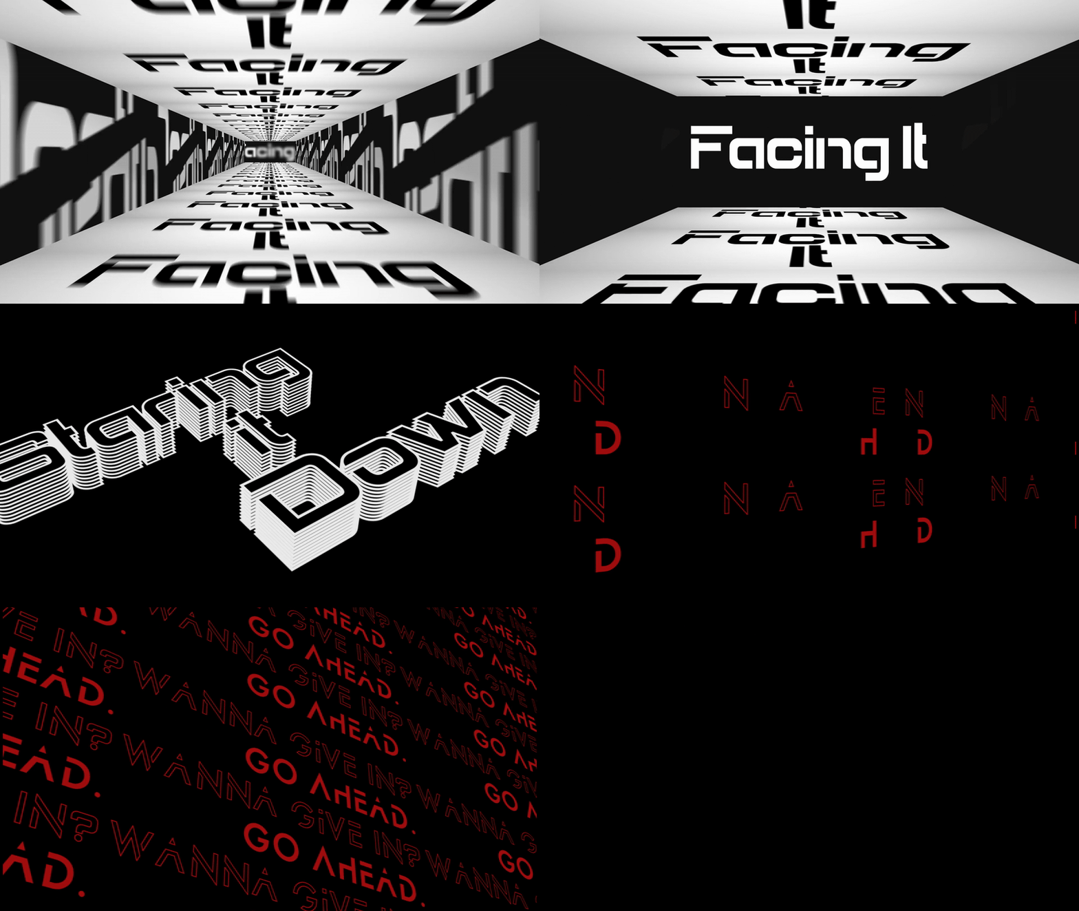
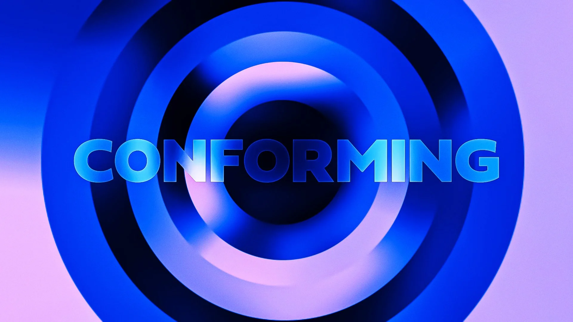
Kinetic typography transforms written language into motion, blending design, rhythm, and timing to communicate emotion and tone. Every movement — whether a subtle fade or a sharp transition — becomes part of the message itself. Through thoughtful pacing, layering, and composition, the type takes on a visual voice, guiding the viewer’s attention and deepening the connection between what’s seen and what’s felt.
Kinetic Type
Kinetic typography transforms written language into motion, blending design, rhythm, and timing to communicate emotion and tone. Every movement — whether a subtle fade or a sharp transition — becomes part of the message itself. Through thoughtful pacing, layering, and composition, the type takes on a visual voice, guiding the viewer’s attention and deepening the connection between what’s seen and what’s felt.
Timed Sequence
Storytelling
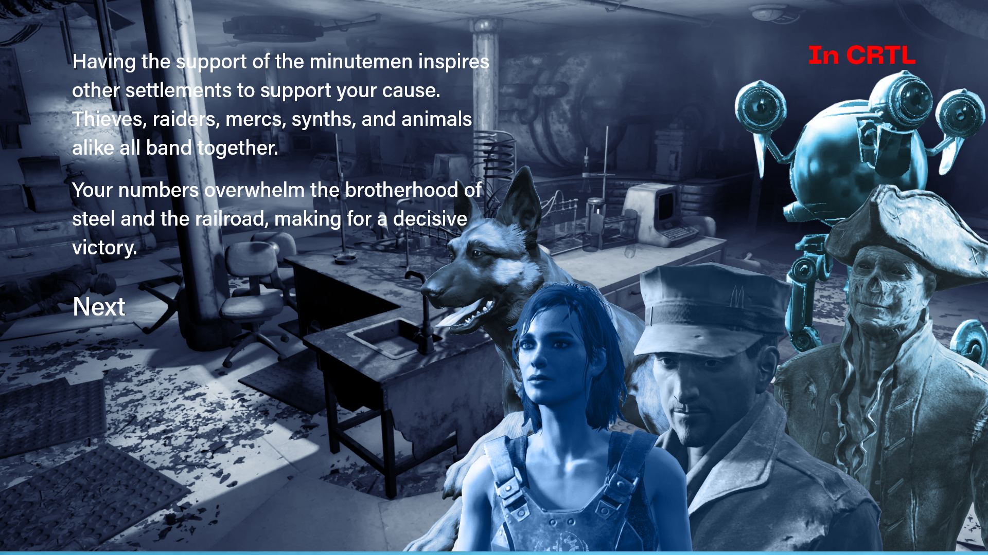
Storytelling that static visuals can’t achieve. Every transition and shift in rhythm carries emotion — guiding how a story is seen, felt, and understood. Movement becomes a form of communication, shaping mood and pacing while giving depth to each design choice. Subtle animations can mirror emotion, build anticipation, or highlight meaning in ways that feel instinctive. Through timing and flow, motion transforms interaction into narrative, allowing each project to speak with its own sense of energy and life.
Print Design
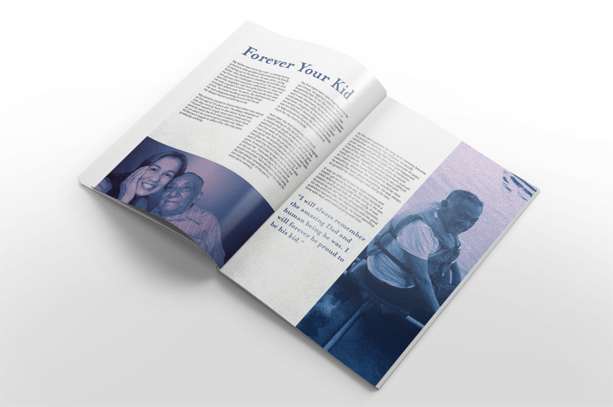
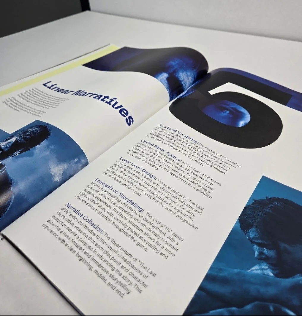
Print design that focuses on clarity, storytelling, and composition. Each piece is crafted to communicate through layout, texture, and rhythm — transforming still visuals into experiences that invite closer attention. From editorial spreads to zines and posters, the work balances visual hierarchy with emotion, creating designs that feel both tactile and intentional.
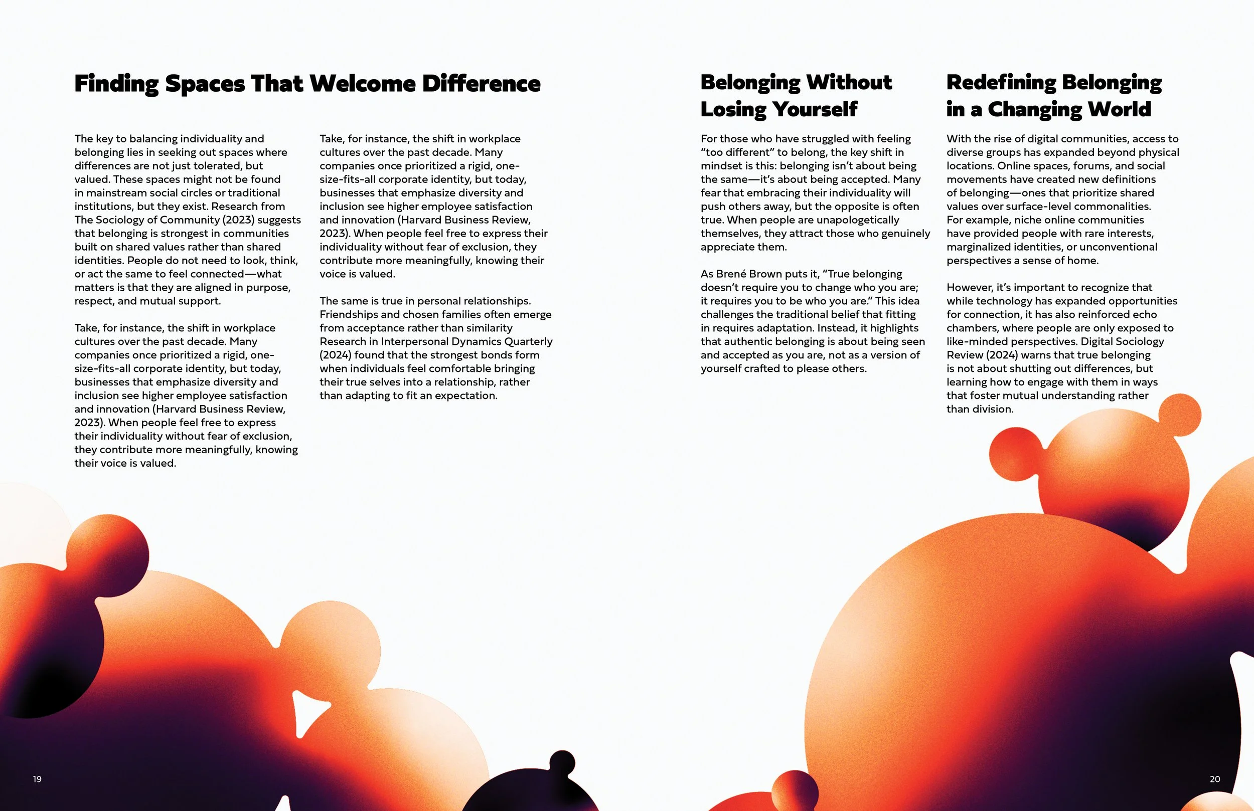
Layout design built around clarity and purpose. Each composition focuses on guiding the viewer’s eye through visual hierarchy, spacing, and proportion. The balance of type, image, and negative space creates structure, allowing the design to communicate clearly while maintaining flow and visual harmony.
LAYOUT
Typography
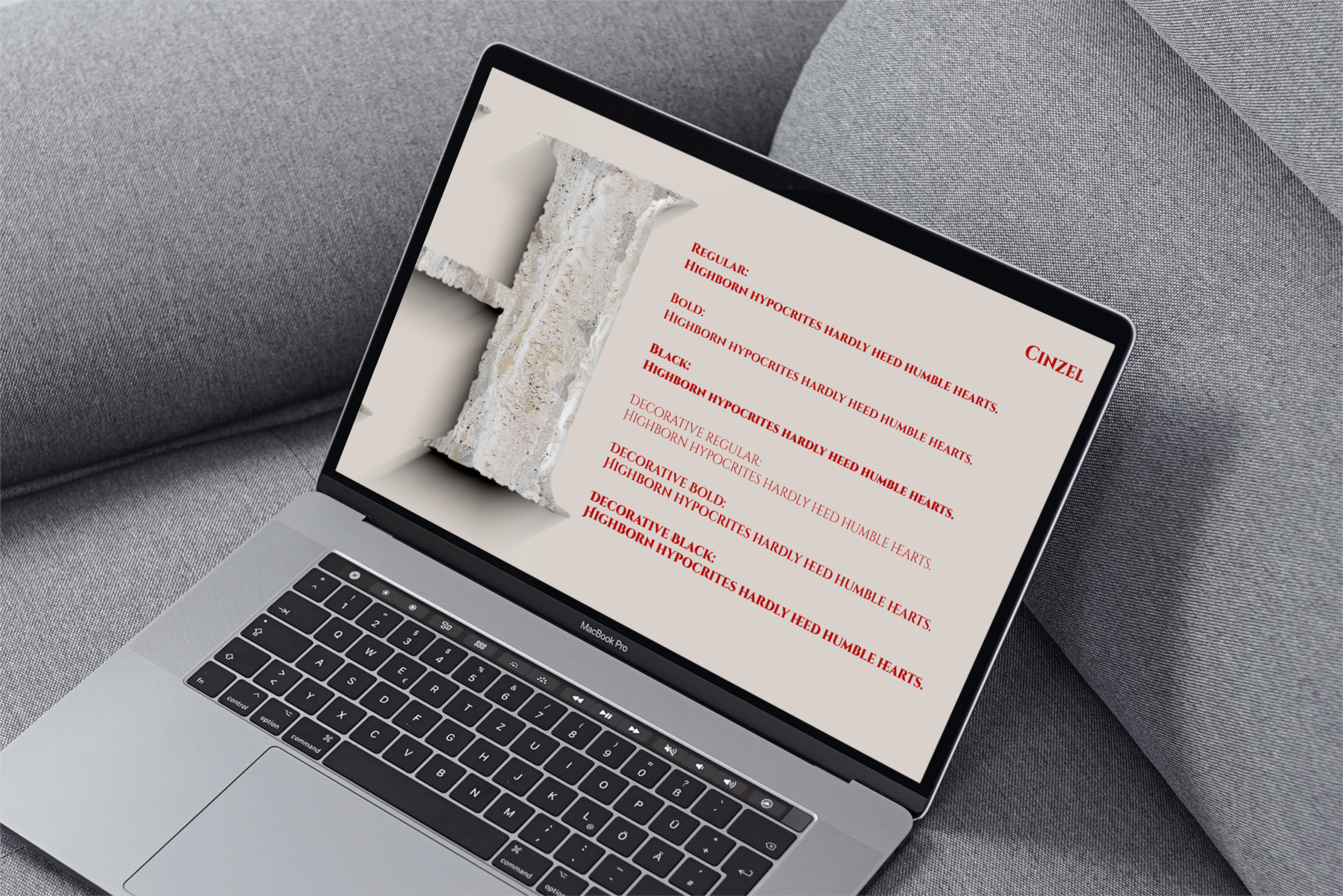
Typography is one of the most powerful tools in print design—it guides the eye, sets the tone, and builds the visual rhythm of a piece. The right type choice can communicate emotion, establish hierarchy, and make complex information feel intuitive and inviting. In print, every letterform carries weight: spacing, scale, contrast, and alignment all work together to create clarity and personality on the page. Typography shapes how the audience understands and connects with the content. Type transforms words into experiences, turning each printed piece into something both functional and expressive.
Aesthetic
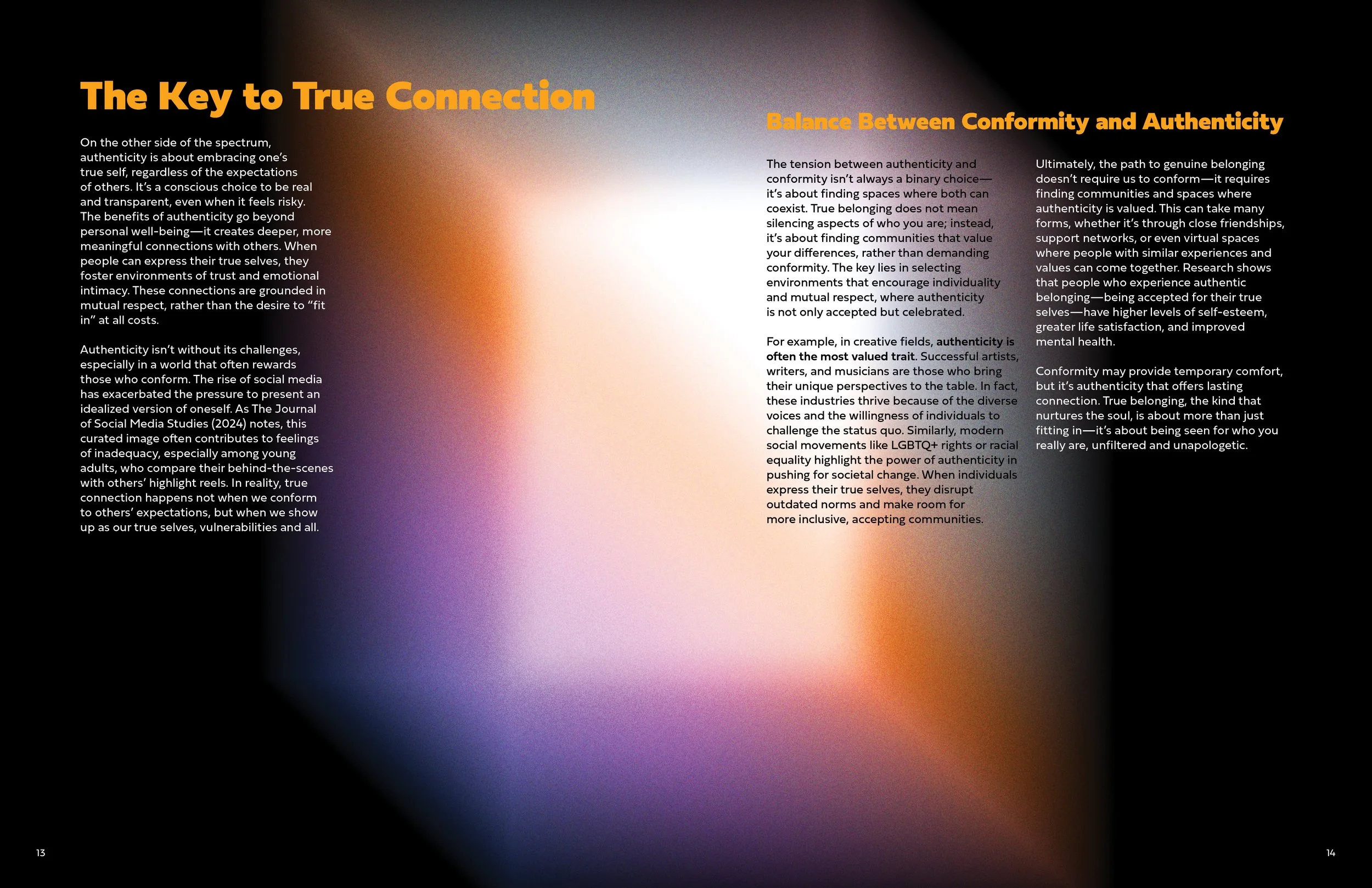
Aesthetics serve as the foundation for how emotion and meaning are communicated through design. Every choice — from color and texture and form — is made with intention to create visual harmony and tone. The focus is on crafting compositions that feel cohesive, immersive, and true to the message behind them.
Web Design
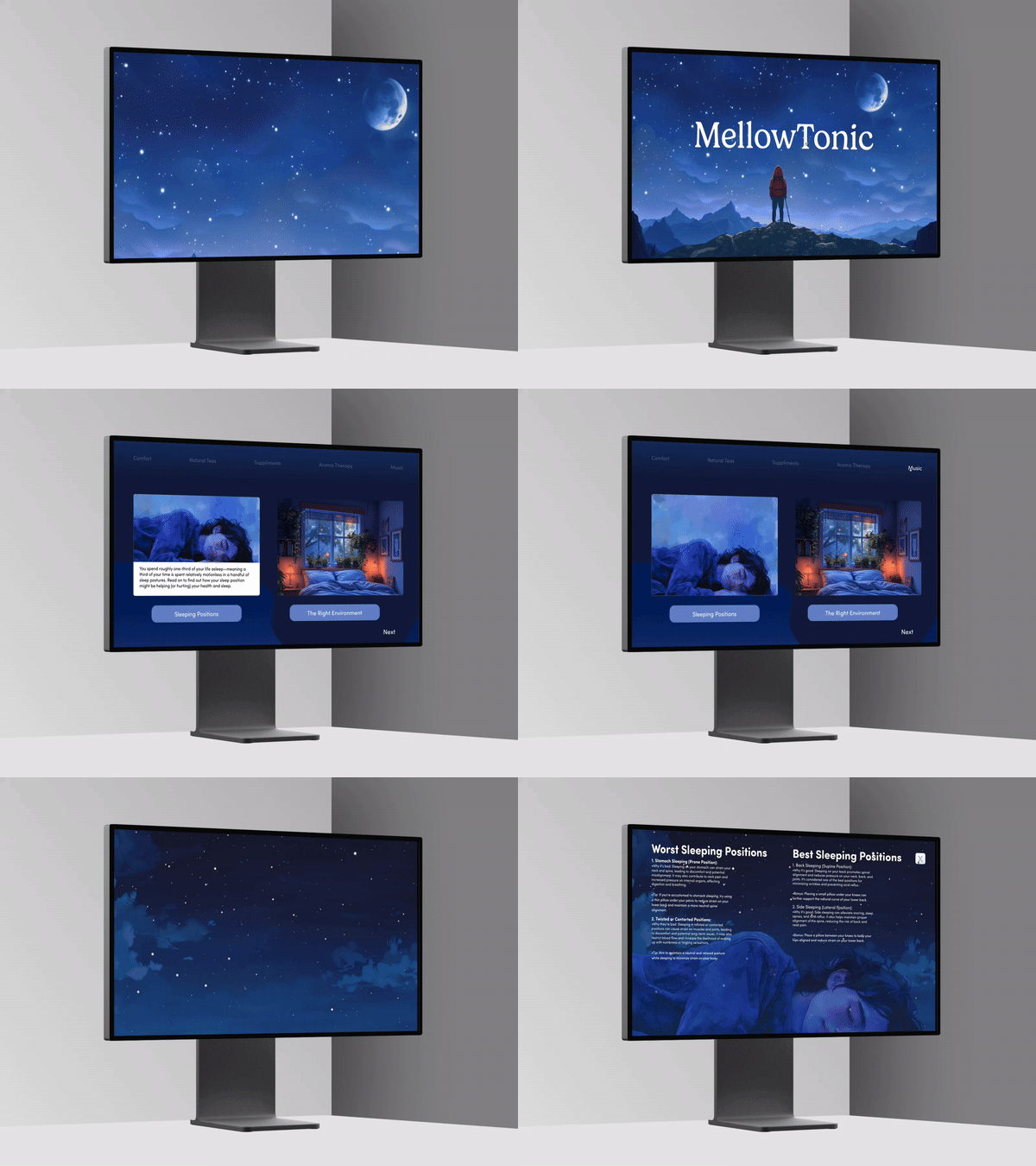
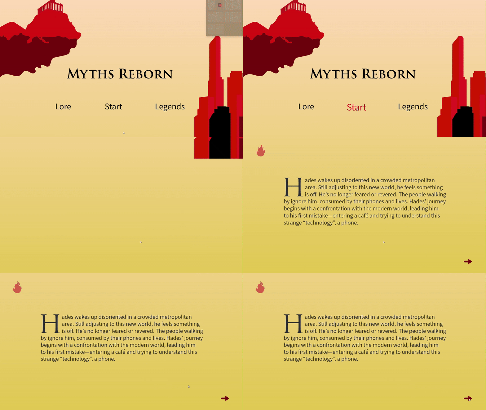
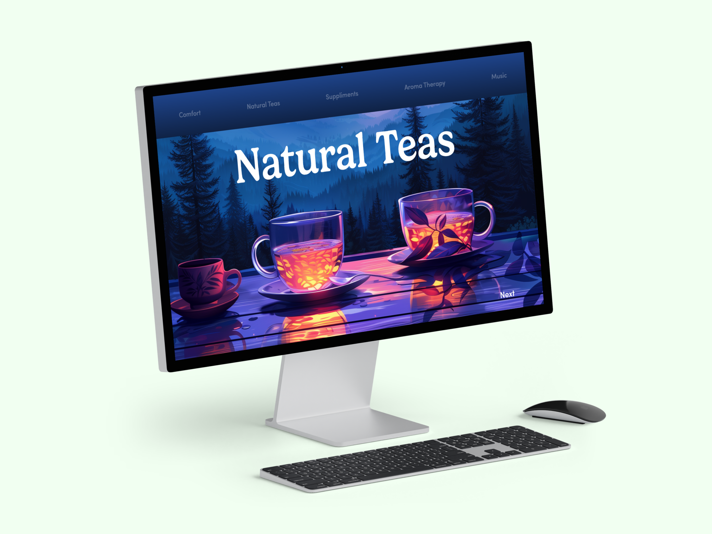
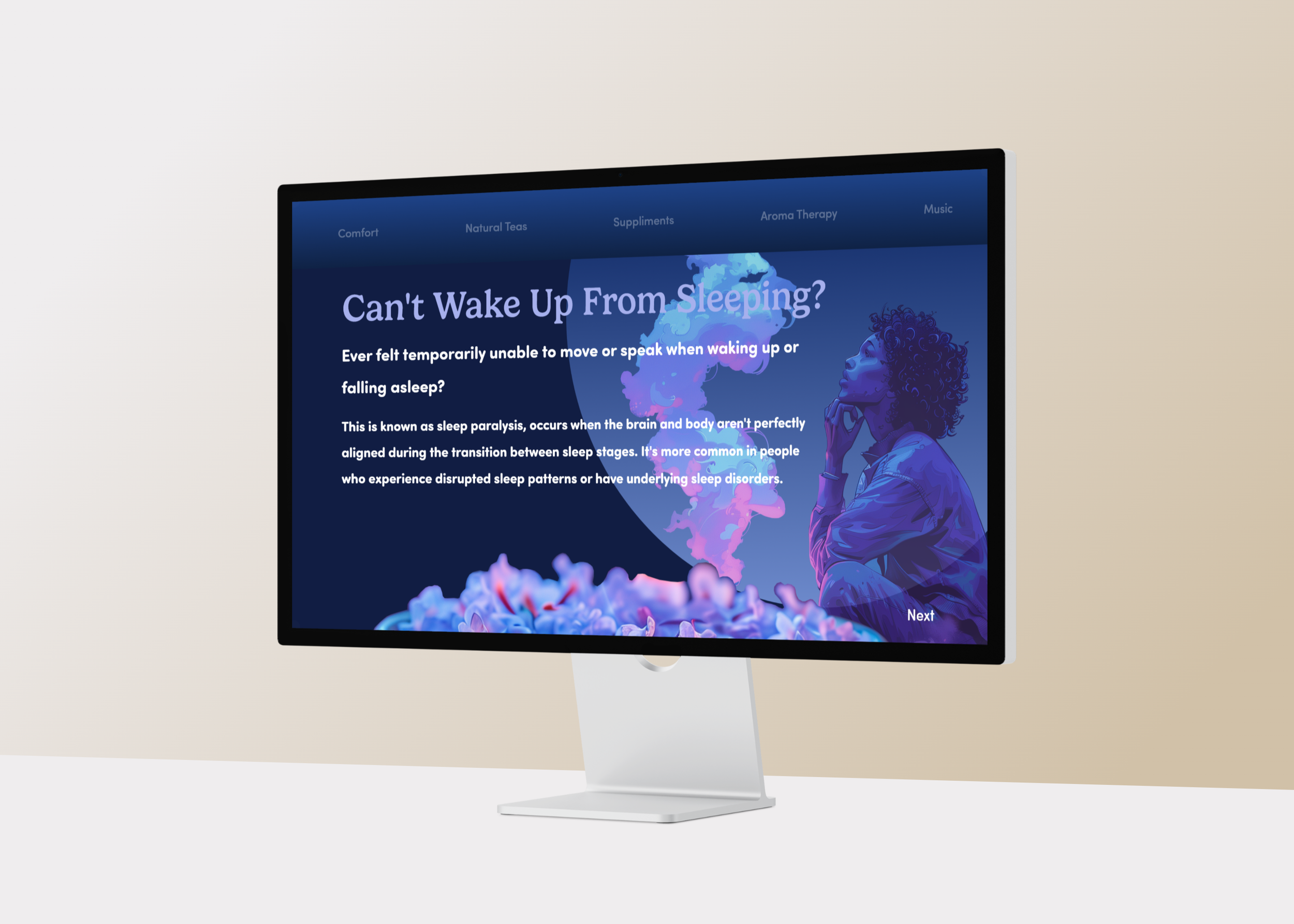
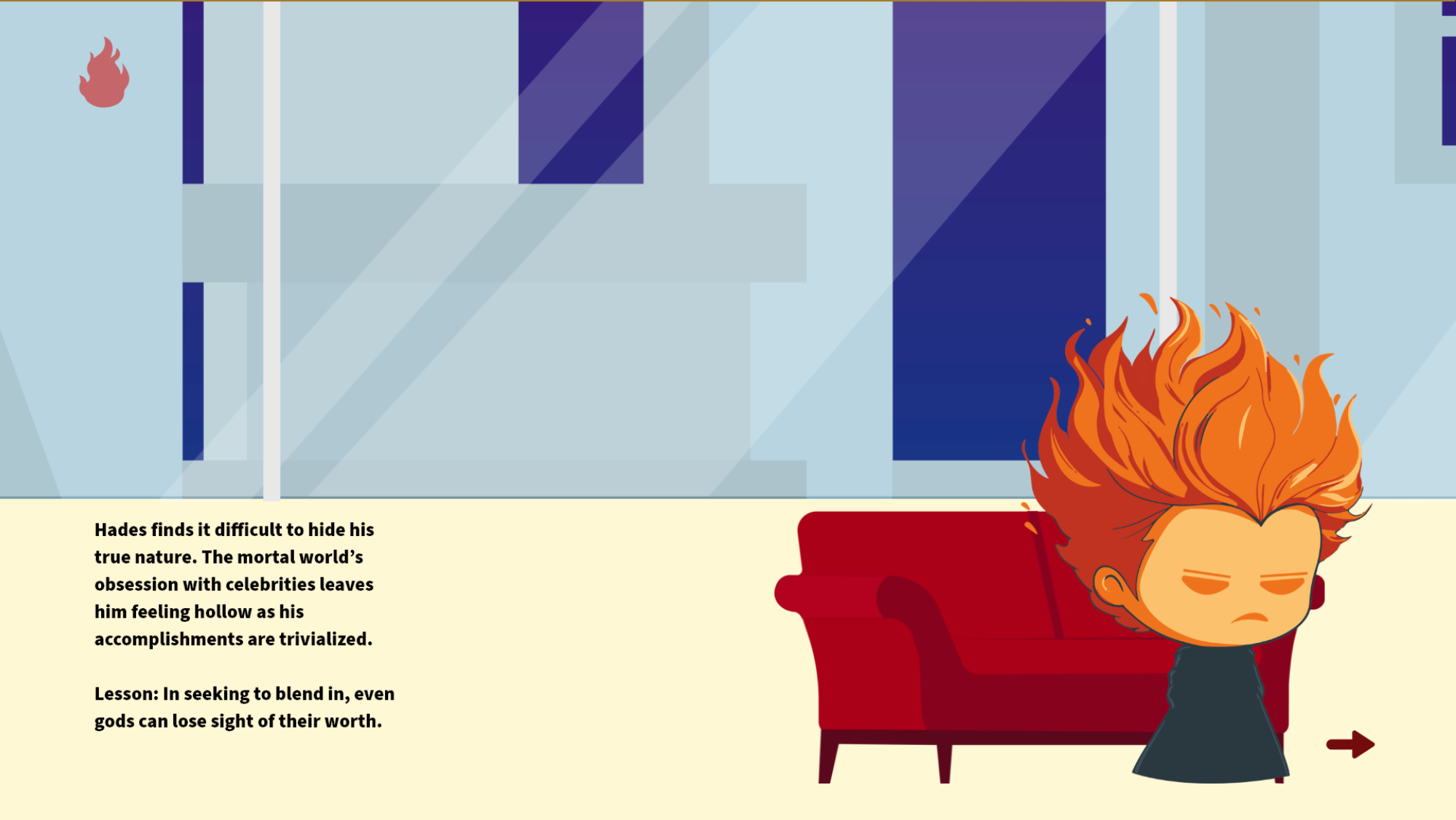
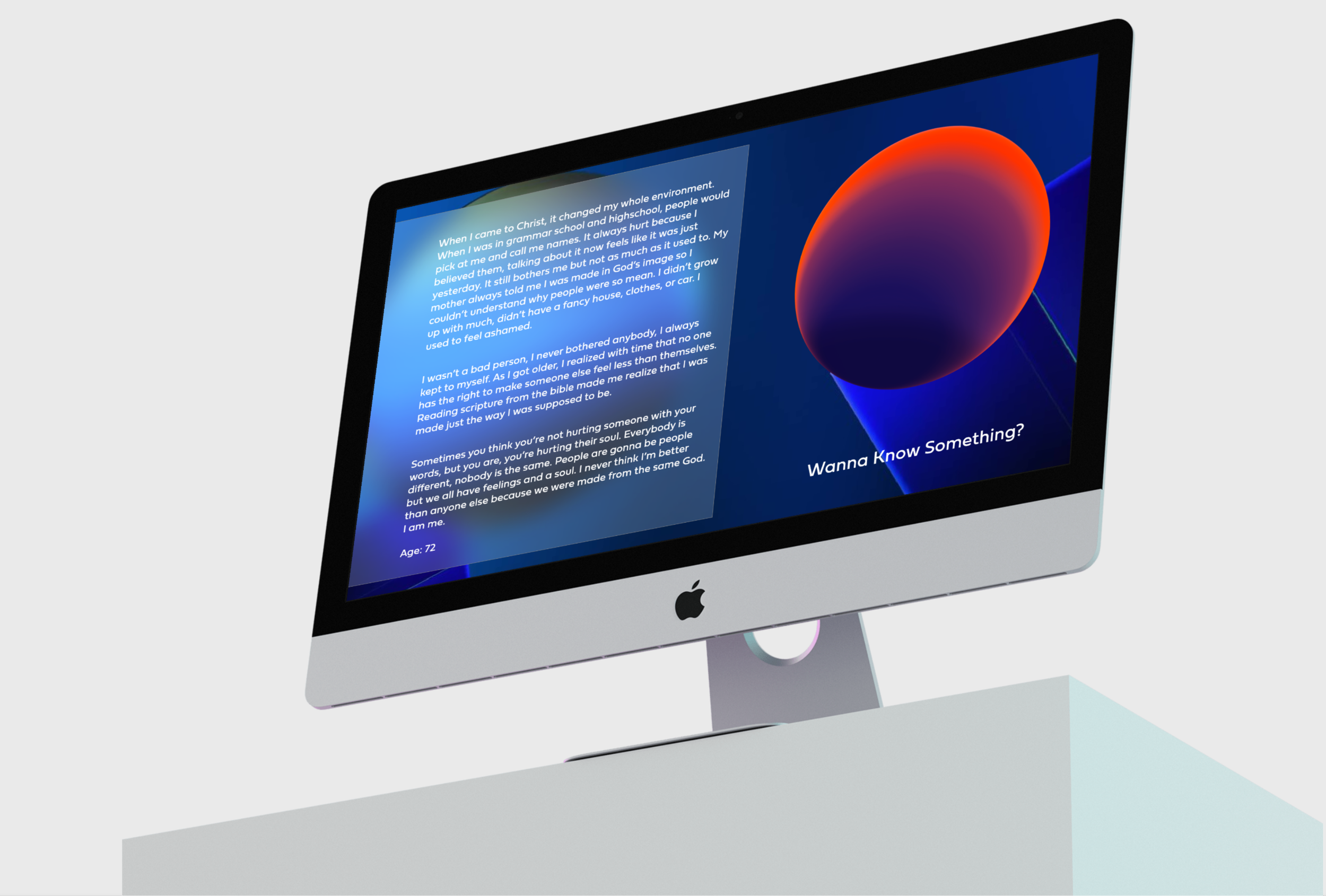
Web design that focuses on clarity and interaction. Every layout, motion element, and visual choice is crafted to guide the viewer through an experience that feels intuitive and engaging. The goal is to create digital spaces that communicate through structure and atmosphere — where design supports the message and every detail serves a purpose.
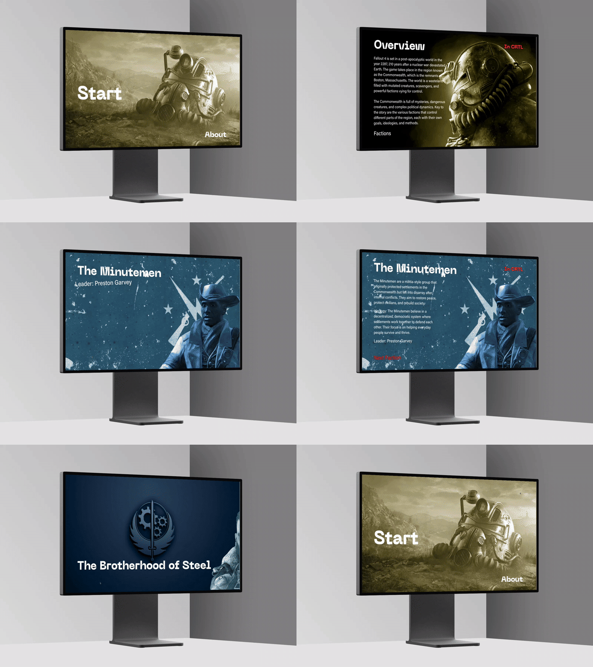
Features like hover states, buttons, animations, forms, and scroll effects create a responsive environment where users can take action and receive clear feedback. These interactive elements help visitors navigate smoothly, understand what’s clickable, and engage with the content in a purposeful way. When features are intuitive and responsive, the site feels modern, usable, and thoughtfully built—turning the design into a space people can actually use, not just look at.
Interaction
Navigation
Navigation is the backbone of a digital experience. It shapes how users move through a site, making information accessible and guiding them with purpose. When navigation is clear and intuitive, it removes friction and allows the design, story, and visuals to connect naturally. Strong navigation ensures that every path feels intentional, letting users explore with confidence and ease.


